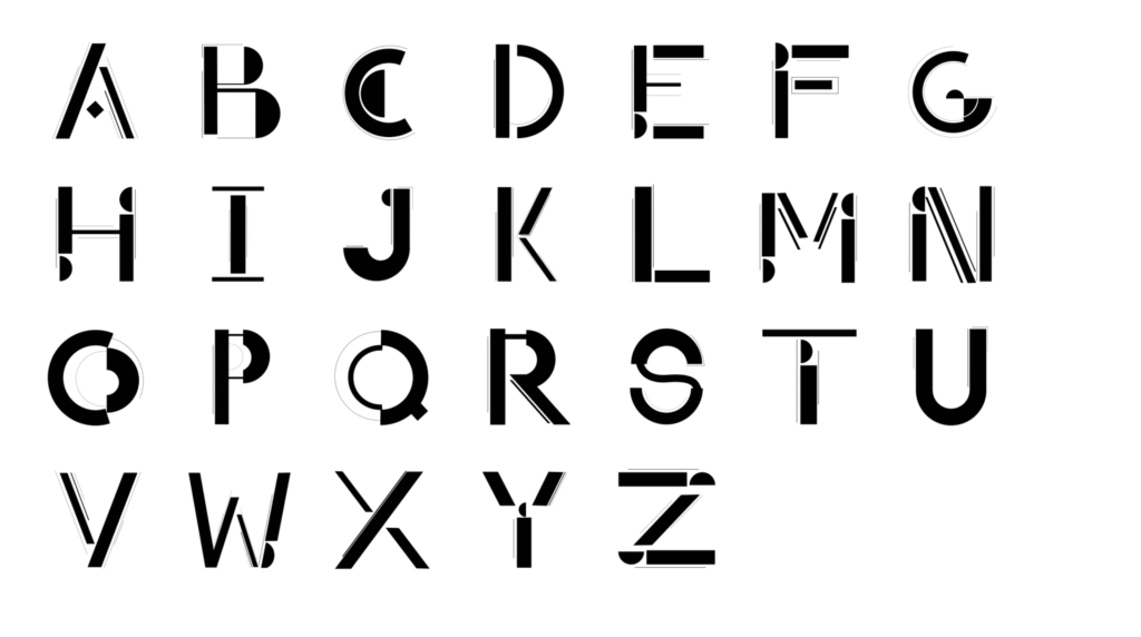
For the “26 Days of Typography” challenge, I designed and animated a unique, tech-inspired typeface that reimagines the 26 letters of the alphabet. Each character was carefully crafted to reflect a balance of modern design principles and futuristic elements, offering a distinctive blend of form and function.The process began with conceptual sketches to explore the personality of each letterform. I then brought these ideas to life using Illustrator, refining the structure and flow of the typeface. Once the design was complete, the letters were deconstructed and animated in After Effects, allowing the typeface to come alive with dynamic motion and fluidity.
This project demonstrates my ability to combine typography, design, and animation, while exploring the intersection of traditional letterforms and contemporary digital aesthetics.